The Home Owner's Loan Corporation |
|
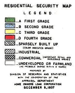
Birth of the Modern Mortgage In the early 1930's, at the height of the depression, lending institutions were extremely reluctant to make loans for housing. Mortgage terms were so steep few could afford them anyway. The typical home loan in 1930 required a 50% down payment and had to be paid off within 5 - 7 years at an interest rate of 6 to 8 percent. Buyers paid the entire interest charge at the end of the payback period in a single balloon payment. Often they had to take out a second mortgage, at rates of up to 18%, just to cover this final payment. In 1934 President Roosevelt established the Federal Housing Administration. The goals of this agency were to encourage the building of new homes and, in the process, create jobs for thousands of unemployed construction workers and craftspeople. The FHA guaranteed mortgage program made possible, for the first time, the types of mortgage terms we take for granted today: only 10% down, up to 30 years to pay back the loan, and an interest rate of 5.5 percent. In 1944 the G.I. Bill made housing even more affordable for 16 million returning veterans. It too provided guaranteed loans, but with 0% down. Minority Report Of course, the government couldn't make these generous terms available for all properties. Banks handling federally guaranteed loans needed clear guidelines indicating where loans could safely be made, and where they could not. A massive inventory was initiated, starting in 1936, to evaluate all residential areas in the nation. The agency created to accomplish this enormous project was the Home Owner's Loan Corporation, or HOLC. The HOLC set strict standards. First, the appraisers (real estate personnel, mostly) looked for any signs of decay or neglect that might indicate a neighborhood was in decline. Surveyors also looked for any sign of minorities. This included not only African Americans but also Jews and "foreign born whites" such as Poles and Italians. Even a single home occupied by a minority family in a distant corner of a neighborhood could cause the entire area to be downgraded for mortgage insurance. In only one year this project produced a collection of "residential security" maps covering every town and city in the country -- several hundred maps in all. These maps were highly confidential; only federal officials and senior bank personnel were allowed to see them -- or even know they existed. Failing Grades Residential areas on these maps were graded on a scale from "A" to "D" with each ranking denoted by a particular color.
B The "Second Grade" or "B" areas were colored blue. These were still good neighborhoods but beginning to fray around the edges. Here mortgage lenders were advised to make loans at 10 to 15 percent below the maximum available amount. C "Third
Grade" areas were colored yellow. These were older neighborhoods with
housing styles that might now be "out of fashion." Often neighborhood
covenants had expired. And, of course, these areas were subject
to "infiltration of a lower grade population." D "D"
neighborhoods were usually struggling for survival -- and the "Fourth Grade"
designation guaranteed the struggle would be a losing one.
Characterized by "undesirable population or an infiltration of it," mortgage
lenders would often refuse to make any loans on properties in these
neighborhoods. It was the racist assumption of the era that when minorities moved into a "nice" neighborhood, property values for all would soon suffer. The great irony is that prior to 1937 this supposition held only the power of myth; after 1937 it was mandated by law. The Emptying of the City With most of the nation's existing neighborhoods now zoned for decline, and new highways opening the way to the "green" pastures of the suburbs, the stage was set for the emptying of the cities. Because Syracuse was rich in multiethnic neighborhoods, it experienced more urban exodus than cities that were less diverse. Today we find that many of 1937's "First Grade" neighborhoods have now, themselves, fallen a grade or two. Home buyers have migrated to even newer suburbs, further yet from downtown. As each new layer of housing is added at the city's periphery, yesterday's new developments enter the process of decline. The edges of the city grow ever wider, the decay at the center grows ever deeper. Maps Rediscovered Several years ago Emanuel Carter, associate professor of landscape architecture at SUNY Environmental Science and Forestry, obtained a copy of the 1937 HOLC redline map of Syracuse. Take a look at it below.
|
 A
The "A" or "First Grade" areas were colored green and had the federal
government's full blessing. These were usually new or recently built
neighborhoods on the edge of town that were virtually free of African Americans
or "foreign-born whites." Lenders were encouraged to offer the maximum
amount available in the "A" areas.
A
The "A" or "First Grade" areas were colored green and had the federal
government's full blessing. These were usually new or recently built
neighborhoods on the edge of town that were virtually free of African Americans
or "foreign-born whites." Lenders were encouraged to offer the maximum
amount available in the "A" areas.